Ohio State blows out Indiana, 38-15. Now, it's time to do the same to That Team Up North.
Let’s face it, being a fan and/or alum of THE Ohio State University is a source of great pride. One of the most common ways that Buckeyes show their pride is by taking the now-famous O-H-I-O photo. As with anything in life, there are right ways and wrong ways to do this.
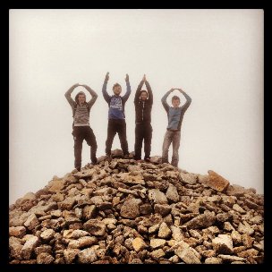 A bit sloppy with the H, bro, but a decent overall effort.
Our goal here is to help you avoid the pitfalls of taking a bad O-H-I-O picture and maximize the quality of your keepsake photograph. You don't want to embarrass yourself or Buckeye Nation. Don't worry, we’ll show you plenty of examples after the jump, noting the positives and negatives involved.
There are three major components to preparing a high quality O-H-I-O photo — location, form, and creativity.
Location is the least important element in your picture. Obviously, the more exotic the locale, the more interesting your photo will be. An underwater O-H-I-O in scuba gear, although done many times before, is much more interesting than your back yard (unless you have a really cool back yard). The top of Kilimanjaro is a better location than your local dog park. Ohio State fans have taken pictures all over this world of ours, from Peru, to Cameroon, to Afghanistan, to China, to Australia, and everywhere else. The best O-H-I-O photos capture the flavor of their locations.
Form is a very important part of your O-H-I-O experience. If you’re going to do this thing, be sure to do it right. If you’re an O, make your arms as round as possible. An H should hold its arms up straight as if signaling a Braxton Miller touchdown pass. Extend the arms directly above the shoulders, with elbows straight. The I is the trickiest letter to represent. The best I is achieved by placing the hands together, with full overhead arm extension and as little elbow bend as possible. Pay attention to your body type, and be honest. Are you really an I or are you more of an O?
Creativity can make your O-H-I-O stand out from all the others. Using a landmark as a letter is a good idea if you pull of the execution correctly, and it’s essential when you have less than four people. Standing next to the Washington Monument and using it as the I is only acceptable when accounting for viewer perspective. Your I shouldn’t tower a hundred feet over the other letters, after all. Also, using the Washington Monument is pretty cliché at this point. You can do better.
Let’s look at some examples:
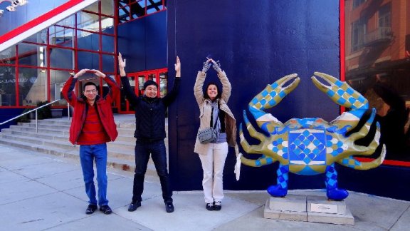
This is a creative idea from some folks visiting Baltimore, MD, which as you know is now B1G country. Using the crab statue as an O was a nice move, although it perhaps should have been the first O instead of the last. H guy is a little round with his uprights, but what really ruins this otherwise outstanding effort is I lady. You're not spelling out "Ohoo," ma'am.
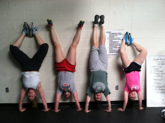
The upside-down O-H-I-O is a nice twist. These Marysville High teachers do a pretty nice job of pulling it off, although the H is bordering on NSFW territory.
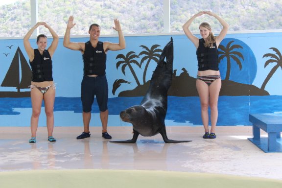
Utilizing adorable animals is a bold move, due to the degree of difficulty. We can forgive H bro's form because his arm height matches the two O girls pretty well, and he keeps his elbows bent at a sharp angle to simulate the letter. The sea lion seems ill prepared here, looking at his trainers for guidance and leaning slightly. We can forgive this because, SEA LION DOING O-H-I-O.
Speaking of leaning I's...
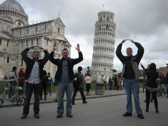
These bros on an Italian getaway stopped in Pisa to see the famous leaning tower. Their execution here is decent, but a little more attention to forced perspective would make the I of the tower more size-friendly with the two Os and the H. They also could have added a little whimsy by leaning, relative to the tower.
Use of the tower allows the O-H-I-O execution despite a missing fourth person. Here's another example:
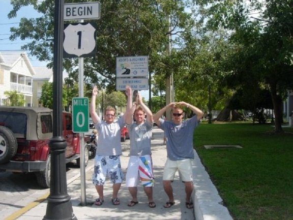
Despite the creative idea of using Mile Marker 0 of U.S. 1 in Key West as the first O, there are a few problems here, including, but not limited to, two pairs of ridiculous shorts. The I guy looks like he's ready for Fins at a Jimmy Buffett concert, but he's not properly prepared to fully commit to his role as the I. O guy on the right is way too flat. And the picture is blurry. Take the shot before you hit Sloppy Joe's, unknown photographer!
You can even do the O-H-I-O with fewer than three people, if you're creative. And there aren't many people more creative than these two fine gentlemen:
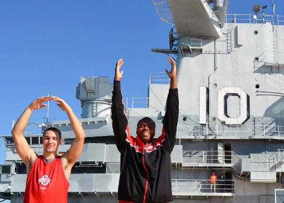
The perspective here isn't perfect, but check out the form by Aaron Craft and Deshaun Thomas. That's a nice, round O and a textbook H. Clearly Thad Matta has drilled a strong fundamental base into these two.
You may not always be able to get a professional to help with your O-H-I-O picture. But if you're short a person or two, and if you can do it, enlist the help of a pro (or two) to round out your crew.
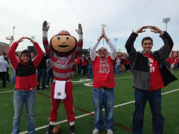
Despite his big, round head, Brutus has excellent H form. The smarter move may have been to make Brutus the initial O, but they pull it off and I'm not sure Brutus's arms are long enough to form a proper O anyway. This is pretty good form all around.
When using two professionals, it's a good idea to keep things symmetrical.
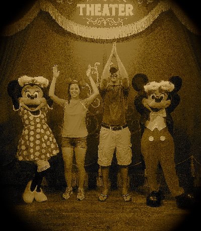
You can tell who the pros are just by checking out their fundamentals. Both mice pull off their O flawlessly. The folks in the middle though...yeesh. Bad form. Bonus points for the artsy filter though.
But what if you're by yourself? You have to take the picture, but there are no people left to pull off the O-H-I-O. Where there's a will, and a little creative thought, there's a way.
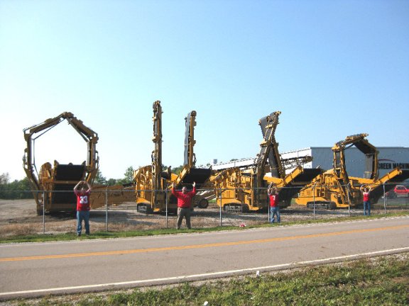
Yes, we know there are people pictured, but they seem superfluous, don't they? You can barely even see O lady. No, the machines are the stars here and this could be the start of Skynet's judgment day, but if it is, at least they'll keep enough humans around for Buckeye football — unless they're making the understandable mistake of thinking Carlos Hyde is a machine.
If you're so inclined, you could use your O-H-I-O photo as an excuse to troll some horrible school.
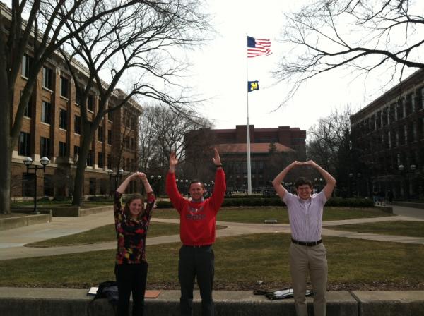
This could have been a masterstroke with a little better forethought. O Lady isn't on her game, the perspective is terrible and they just plopped their crap on the wall there, where it would be seen in frame. Even a subtle change like standing on the wall would have made this a lot better. Still, it was an attempt to troll Michigan so we're OK with this, despite the presence of nerdy O guy.
The above photo from Ann Arbor is a great illustration of why it's important to plan your photo. Don't just rush into it willy and/or nilly. I mean, these people aren't even trying:
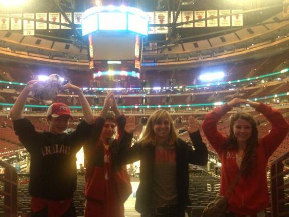
FAIL. If they can't spell the word "Ohio," how did these people even get to the B1G tournament in Chicago? Congratulations, you've spelled "Oiho," and O guy didn't even close the top, so it's more like "Uiho." H girl appears to be happily getting robbed. Always check the photo before you move on. This is the digital era, people.
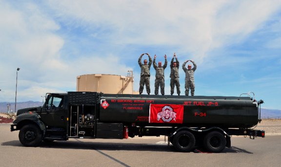
We'll leave you with a good example of how to get your photo right. The shot below combines all the right elements. The location and form are excellent, there's some creativity involved with the inclusion of a jet fuel tanker as a prop, as well as the OSU flag proudly displayed on the side of the truck, and, most importantly, 'MURICA!
