One of the small joys of Big Ten Media Days is getting your hands on the B1G-branded USB drive packed with the football media guides of all league programs.
We live in an era of talented graphic designers embedded in football programs and the cover of a media guide is one of the most important tasks they'll face. Not only can the cover help set the tone for the season (okay, maybe that's a stretch), but media guides are powerful recruiting tools, serving as the gateway to 100-plus pages of humble- and not-so-humblebrags.
By and large, covers of the media guides of Big Ten programs hit the mark this year, but as always, there were a few duds. Here they are, ranked.
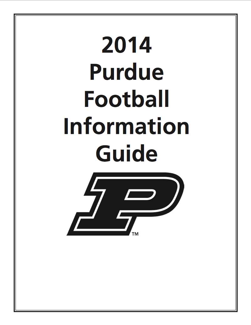
#14 Purdue
I'm pretty sure Darrell Hazell designed the cover of Purdue's 2014 football media guide. To be fair, Purdue's cover looks like this every year, though.
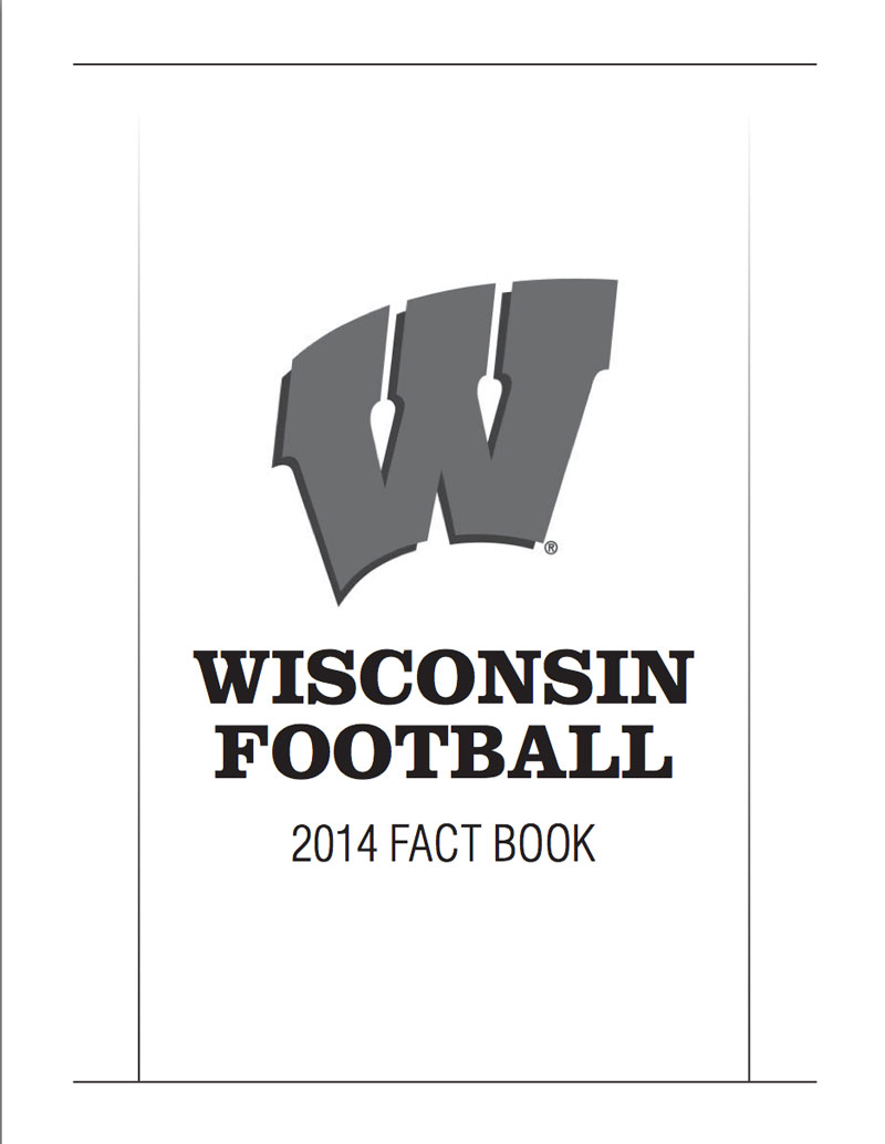
#13 Wisconsin
Wisconsin, like Purdue, rides the austerity wagon when it comes to media guide covers. Which is a shame, because the program has quite a few things to boast about in recent years (at the top of the list would be the fact that Bret Bielema has taken his stumbling act to a new city).
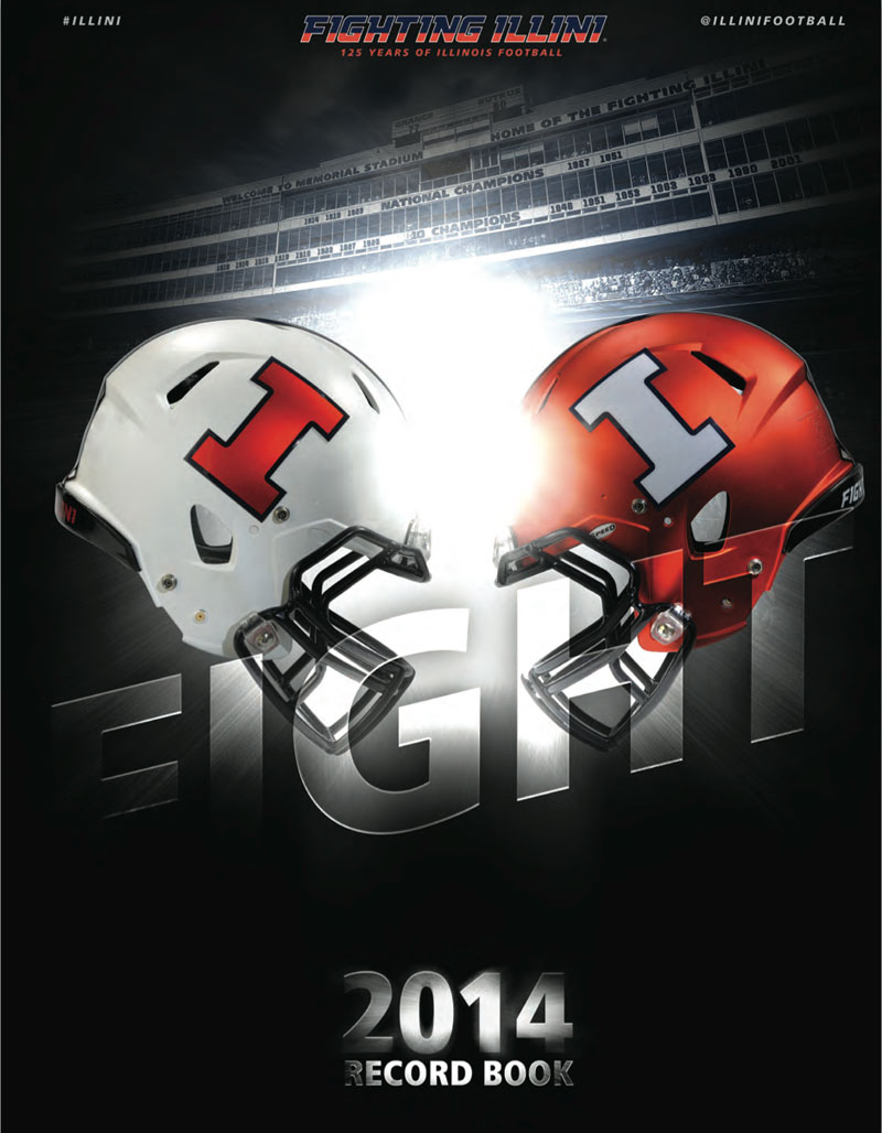
#12 Illinois
We get it, Illinois, you have cool new helmets. Nice touch adding the Memorial Stadium press box. Not pictured: thousands of empty seats.
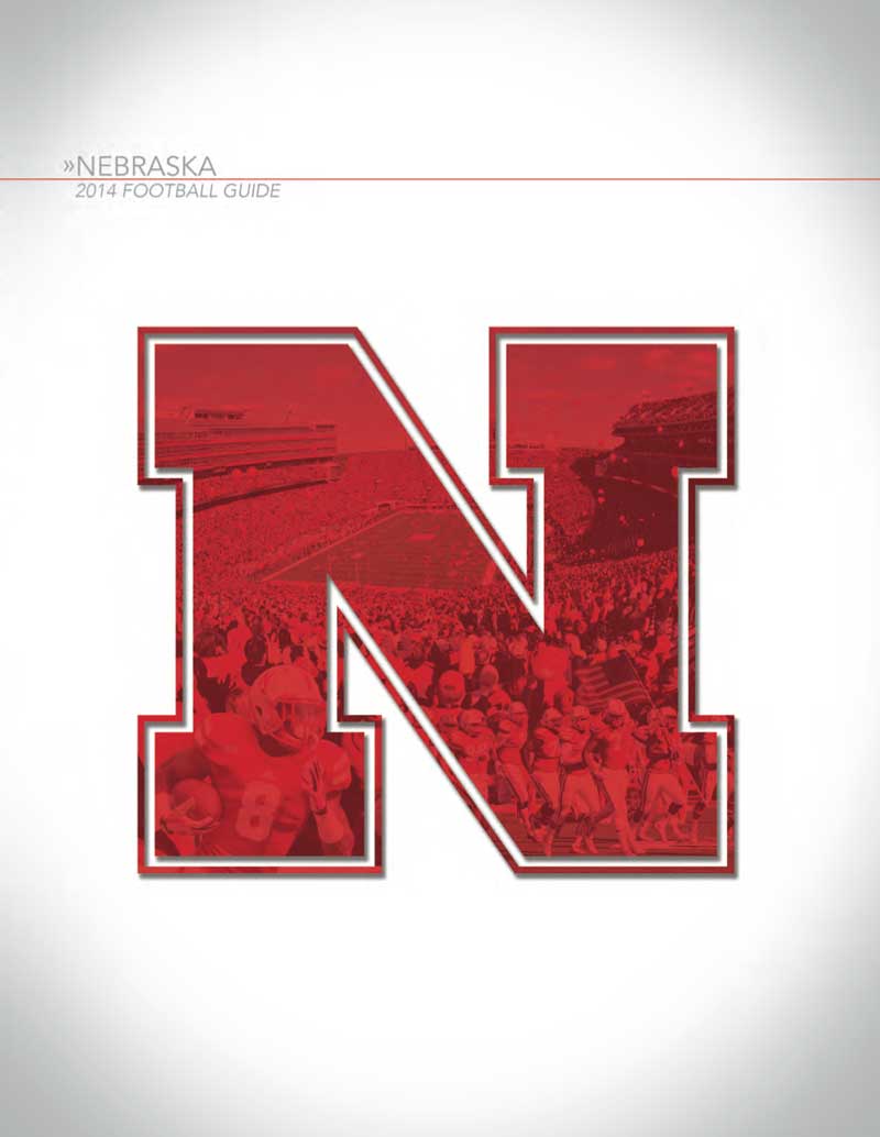
#11 Nebraska
If clean is your thing, the cover of Nebraska's media guide is strong. But this cover should be a photo of Pelini holding his cat.
#10 Iowa
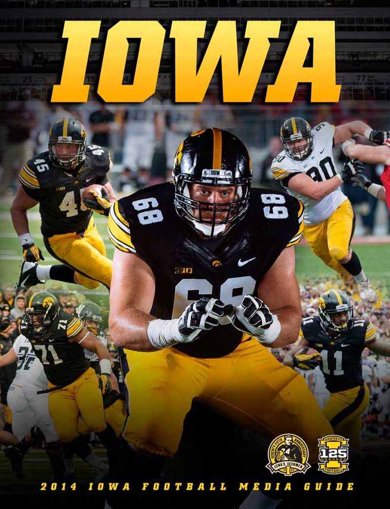
Ah, the classic player montage on the cover of the Iowa media guide. Left tackle Brandon Scherff gets the star placement on a cover that features two other linemen and a skill player wearing No. 45. That's peak Iowa.
#9 Northwestern
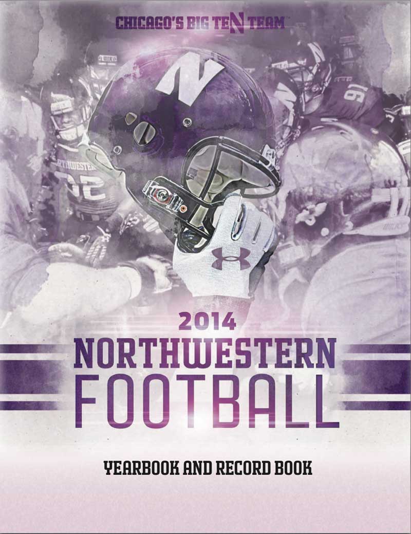
Northwestern gets points for somehow coming close to creating a menacing media guide cover with purple as the dominant color. Also, the "Chicago's Big Ten Team" effectively jabs Illinois, so there's that.
#8 Minnesota
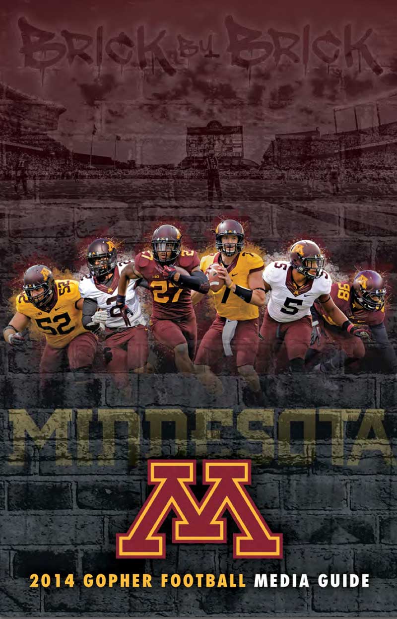
If you had Minnesota as the program that would bring grunge and a graffiti font to a media guide cover, take a bow. I probably would have slotted them a bit lower, but my affinity for Jerry Kill bumps them up in the rankings.
#7 Ohio State
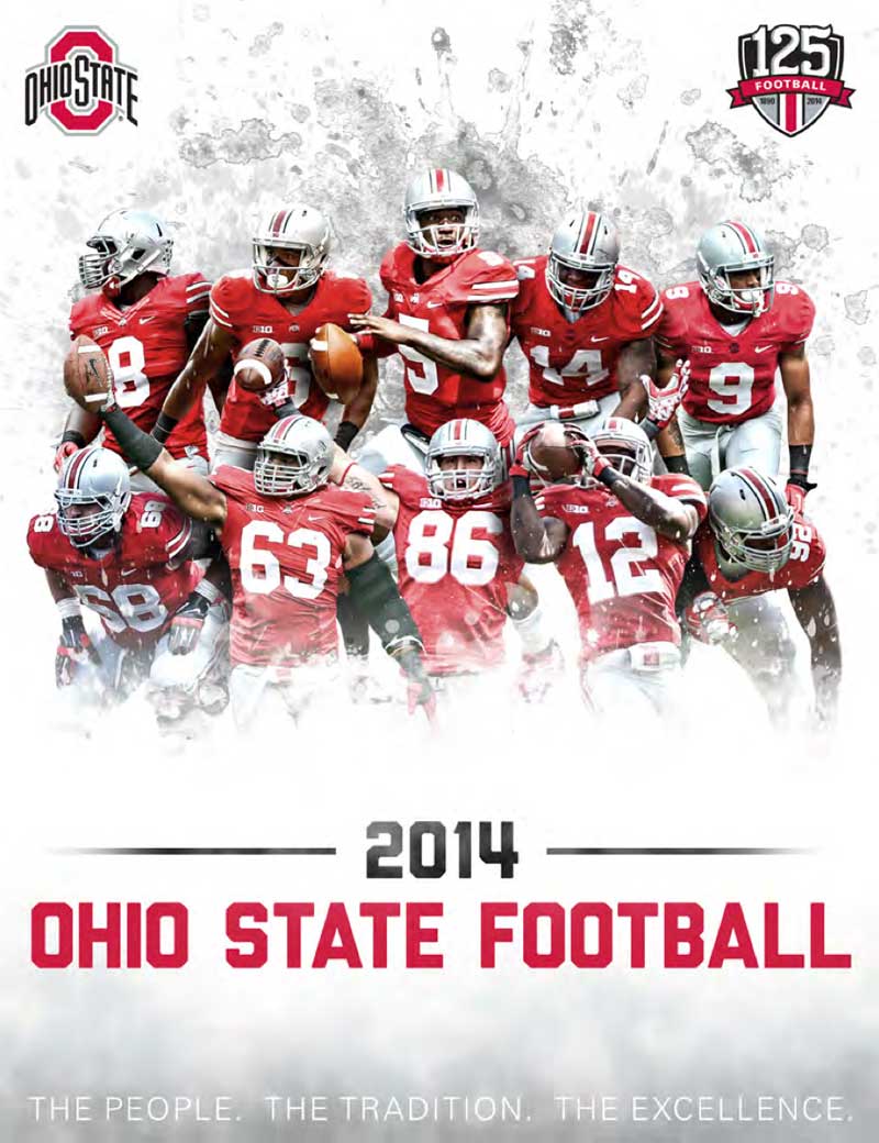
Of course Ohio State's cover looks great because of the Block O and all of that scarlet and gray. But replace the logo and colors with another school and it's just a good, but not exceptionally great media guide cover.
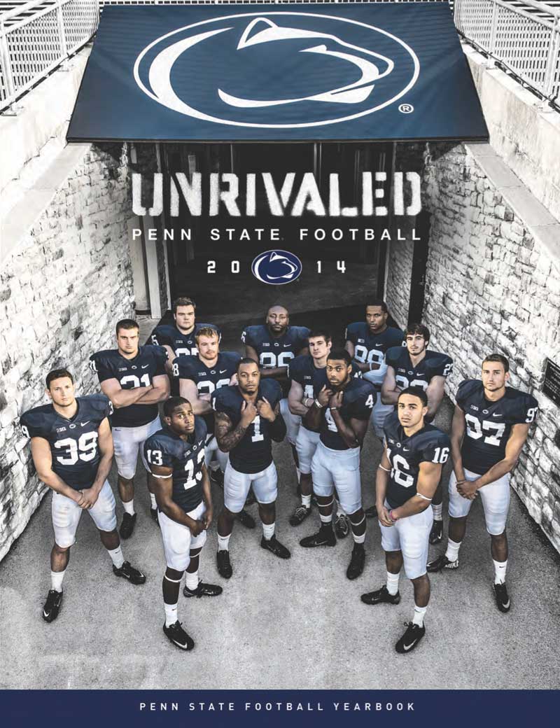
#6 Penn State
Penn State went with a shot from Beaver Stadium for its cover and it works. Bonus points for not taking the photo in front of a Paterno statue or memorial.
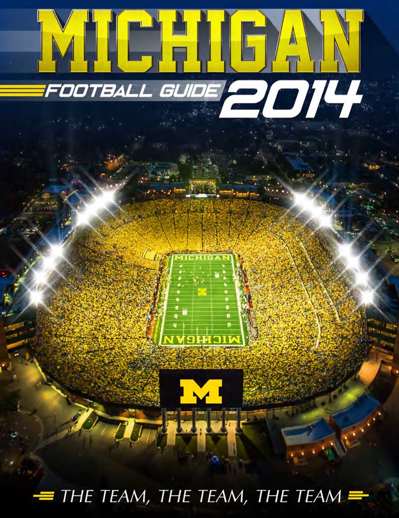
#5 Michigan
What do you do when your team goes 3-5 in Big Ten play? Why, you feature your cathedral of a stadium – at night, no less. It's a great photo of Michigan Stadium. So great, you can almost forget it's packed with fans rattling car keys.
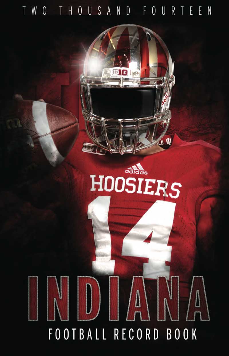
#4 Indiana
Congratulations, Indiana graphic designer. You managed to do the impossible: make Hoosier football seem intimidating.
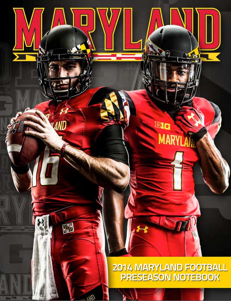
#3 Maryland
Quarterback C.J. Brown and wide receiver Stefon Diggs feature on Maryland's media guide cover. Remember: when in doubt, mean mug.
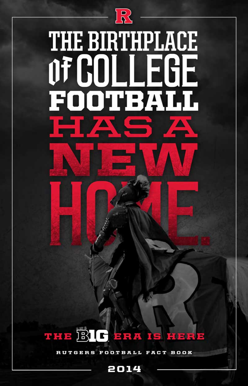
#2 Rutgers
I love this Rutgers cover. It manages to both tout the school's role in college football history while also showing excitement for joining the Big Ten. It's pretty cool they managed to get a shot of the Hound in action, too. Or is that Jaime Lannister? Either way, it works.
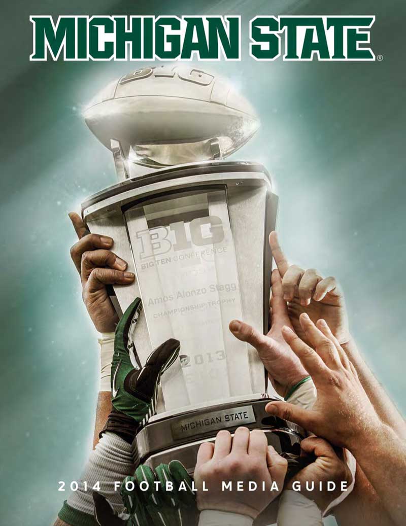
#1 Michigan State
What can you say – scoreboard always works on the cover of a media guide and Michigan State enjoyed scoreboard quite a bit last season, dumping Michigan for the fifth time in six games, knocking off undefeated Ohio State in the Big Ten Championship Game and then locking up the school's first Rose Bowl win in nearly 25 years.
