If you have not yet heard, Ohio State plays Clemson in the College Football Playoff Semifinal on New Year's Eve.
While I'm sure that game will be fine and good, and you can read all about it on Eleven Warriors Dot Com, I'm here to talk about a much more pressing matter.
Clemson's mascot is creepy, unimaginative and just bad all around.
The History
Clemson's mascot is a Tiger, which is fine if you're a local tee-ball team. As far as mascots go, a tiger is pretty much as unimaginative as it gets. It's the most common team name in Division 1 football and the second most common across all American sports at the high school, college and professional levels, being used by 1,354 different teams, according to cheatsheet.com.
The name choice is undoubtably unoriginal, but best part is Clemson didn't even come up with it on their own. The school actually stole the idea of using America's second-most generic mascot. When Walter Merritt Riggs – the father of Clemson football – came to the university, he took the Tigers name from his alma mater, Auburn, and brought it with him.
The good news is, when you make your mascot something as basic as a tiger, it's pretty much impossible to screw up, but Clemson did it.
The first failure was deciding to have a costumed mascot that wasn't actually a tiger.
While the athletic teams were nicknamed the Tigers since 1896, a tiger mascot didn't appear on the field until over 50 years later. Meanwhile, Clemson had a different costumed mascot representing the team (which was still nicknamed the Tigers) – the Country Gentleman.
The Country Gentleman was on the Clemson sideline until 1973, when the school made numerous changes to distance itself from antebellum south.
The Tiger Pregame Show describes the Country Gentleman as follows.
A top-hatted character in a purple tail coat, with a cane, he represented the Southern hospitality and class of the Clemson student, epitomized by the phrase, "a Clemson man needs no introduction."
The description of Clemson's first mascot – one that it had on its sidelines for over 30 years – is nearly identical to the first result when you perform a Google Image search for "pimp outfit."
So as we move on, do keep in mind that the heinous aberration Clemson currently uses as its mascot is somehow a drastic improvement on the original concept.
The Tiger
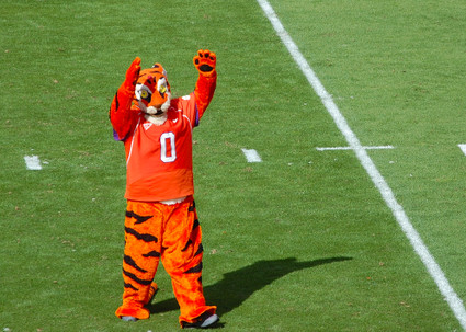
The thing's name is "The Tiger." That's it. Seriously. Clemson chose the most generic mascot in college football and doubled down by giving it the most default name possible. It's almost like someone forgot to fill in a box in the create-a-mascot feature of a video game.
I'm not referring to this thing as "The Tiger" throughout the rest of this piece because that's more obnoxious than Clemson's colors scheme, so he will henceforth be known as "Dave" because it's generic enough to be on brand yet still better than what they currently call him ("8-Ball" also works).
Here's the thing – anthropomorphic mascots are already creepy as hell. You don't need to do anything else to make them more creepy. But see, this is where Clemson decided to step out of the box.
Every other tiger mascot in Division 1 – Auburn, LSU, Memphis, Missouri – follows a similar recipe: a big and cute head, small and discrete black eyes and a relatively seamless and tight body suit. Dave just threw all that out the window.
Dave's head is tiny, which to be fair is more realistic than his humanoid tiger counterparts. However, if you're going for realistic, you probably shouldn't be putting a human inside a plush, bright orange tiger costume in the first place. The tiny head is unnerving and kills the cute, cartoon character vibe.

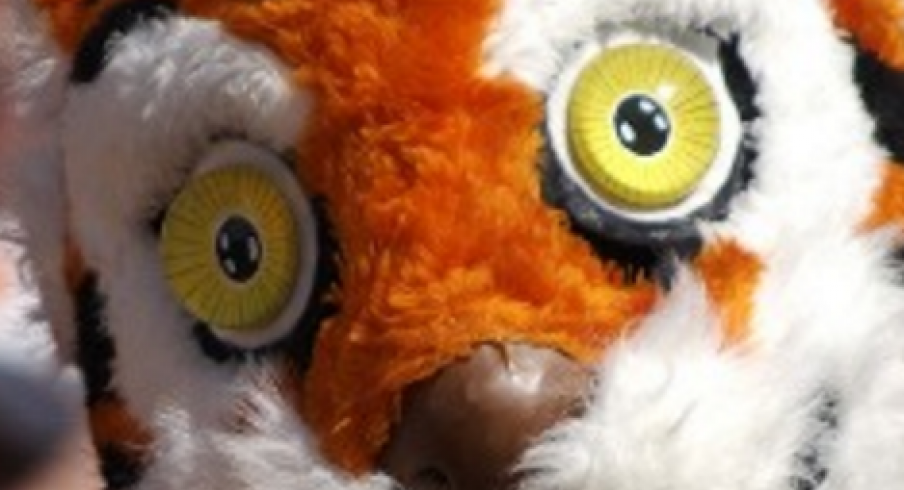
In the face, Dave gives off the vibe of a coked-out orange dementor with stripes and whiskers. His eyes seem ready to lock you into a hypnotic trance while he sucks out your soul to use as collateral in a future back-alley yayo deal.
The rest suit looks like something you'd find at a local carnival or a middle school sporting event. It's far baggier than it should be, the seams at the hands and the neck are obvious, and in most cases you can blatantly see the wearer's shoes underneath the foot flaps. It just has the look of a stuffed animal a child picks up off the street and you have to scream "don't touch that, you don't know where it's been!"
It's no wonder CBSSports.com ranked Dave as the No. 4 scariest mascot in college football. He was topped only by Oklahoma State's Pistol Pete (which, yeah), Maryland's Testudo (which is pretty much a Ninja Turtles villain) and Purdue's Purde Pete (which, yeah).
Dave is bad, creepy, has the eyes of a coke head and to top it off, is painfully awkward:
The Cub
In 1993, Clemson decided to double up on horrendous mascots, adding an (ostensibly) younger version of Dave, ever-so-creatively named "The Cub" (David).

David is mostly terrible as well, but to his credit is definitely not worse than his counterpart, Dave. His eyes are far less tweaky and soul-sucking, and he has oversized shoes which totally cover the shoes of the wearer – so at least two fewer problems than Dave.
The other problems are still there. David still looks like a disease-ridden chew toy, his seams are somehow even more noticeable than Dave's and his suit is even baggier.
The most glaring issue is his jersey. Clemson so brilliantly decided David's jersey should be No. 1/2, which would actually be moderately clever if Dave were wearing No. 1 instead of 0. As it is, instead of a number that's adorably smaller than that of his older counterpart, David's number appears to be just an arbitrary fraction.
Good try, good effort, Clemson.
I do not know who will win when the Buckeyes play the Tigers on New Year's Eve, but I do know that Clemson's mascot is so horrendously creepy and uncreative that it is somehow objectively worse than Brutus, who is an anthropomorphic tree nut with a striped shirt.
Go Buckeyes.


