Halloween is a magical time for children, college students, and inhumane assholes. One of the holiday's best features — besides stuffing your maw with handfuls of discounted candy in its immediate aftermath — is jack-o-lanterns.
From where did the idea of carving spooky things into hallowed out fruits come? Well, even the summation of human knowledge, Wikipedia, is uncertain:
The origin of Jack o' Lantern carving is uncertain. The carving of vegetables has been a common practice in many parts of the world, with gourds being the earliest plant species domesticated by humans c. 10,000 years ago, primarily for their carving potential. Gourds were used to carve lanterns by the Maori over 700 years ago, with the Māori word for a gourd also used to describe a lampshade.There is a common belief that the custom of carving jack-o'-lanterns at Hallowe'en originated in Ireland, where turnips, mangelwurzel orbeets were supposedly used. According to historian Ronald Hutton, in the 19th century, Hallowe'en guisers in parts of Ireland and the Scottish Highlands commonly used jack-o'-lanterns made from turnips and mangelwurzels. They were "often carved with grotesque faces to represent spirits or goblins."
So, hundreds (maybe thousands) of years of human history have culminated in this: the 2014 Buck-O-Lantern ballot, as curated by the indomitable Brutus Buckeye.
And while all ten entries are worthy of some sort of recognition, there can only be one Buck-O-Lantern to rule them all. HERE IS HOW YOU SHOULD VOTE.
10th place: RUNNIN' BRUTUS

This is a fine Buck-O-Lantern. Although it's clearly lacking in originality, the execution and replication of the Brutus logo is well executed into pumpkin form. I'm also a big fan of the glowing, fire eyes. The fact this finished in tenth tells you all you need to know about the stiff competition in this year's Buck-O-Lantern contest.
NINTH PLACE: BRUTUS CARRIES THE FLAG

Again, another fine Buck-O-Lantern. The reason it finished ninth is obvious: its degree of difficulty. And while I'm a fan of the candle light behind the Ohio State flag, it suffered in the originality category.
EIGHTH PLACE: BRUTUS DOES O-H-I-O

This entry is quite spooky because it looks like this pumpkin is floating through the nether regions of space. THAT'S HOW YOU HALLOWEEN, FOLKS. This Buck-o-Lantern's execution is flawless, and we're starting to see originality enter the contest. However, the "BRUTUS" label was completely unnecessary. One of the most iconic figures in Buckeye history does not need a label.
NOTE: As Doc pointed out, Brutus' shirt does indeed say BRUTUS across it. I regret the error.
SEVENTH PLACE: BUCK-O-LANTERN INVADES HAPPY VALLEY

At first, I dinged this Buck-o-Lantern due to the horrendously misshapen state of Ohio, but then I realized I was an idiot: that's a football field/stadium. While others might have been executed better, I am a fan of the rising sun behind the goalposts and the fact its owners risked a smashing by taking it to Happy Valley.
SIXTH PLACE: FEAR The nuT

Now we're cooking with peanut oil wolverine blood. I'm a big fan of the execution of this pumpkin, and Brutus has never looked more intimidating. My only complaint is the word "WOLVERINE" is featured too prominently, and the FEAR THE NUT concept has been done before.
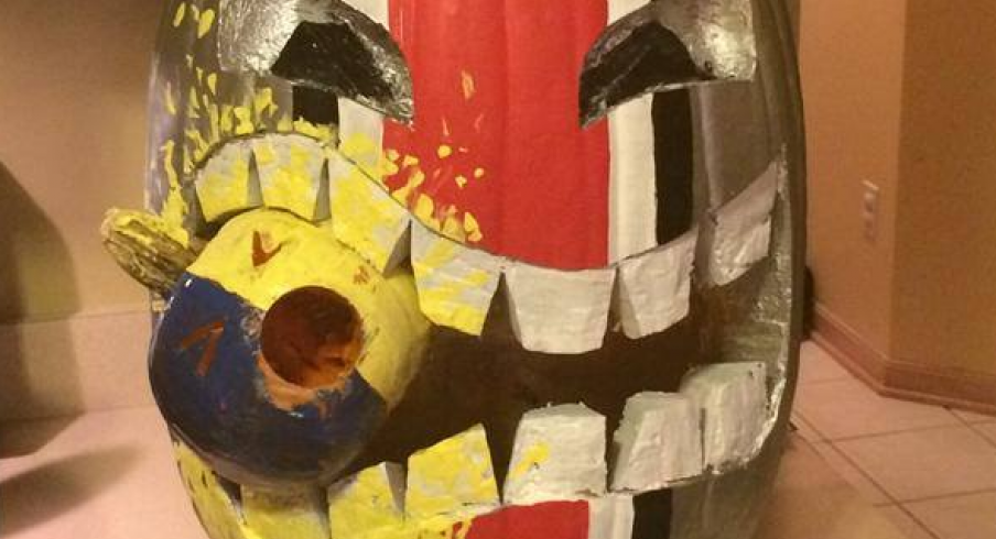
FIFTH PLACE: BRUTUS TAKES A BITE OUT OF A BLOCK M

Brutus hasn't looked this creepy since 1979, so that's well done. I'm also a fan of the doe-like eyes, which make the blood-soaked fangs even more intimidating. The only thing that holds this guy back is a bending of the rules: is this truly a Buck-O-Lantern? I'm not so sure.
FOURTH PLACE: HELMET JACK-O-LANTERN

I know the Illinois clash falls on November 1st, but Ohio State should seriously consider wearing these as their helmets. THINK ABOUT WHAT IT WOULD DO FOR RECRUITING, URBAN.
THIRD PLACE: WOODY LIVES

See what I mean about iconic figures needing no labels? This design is simple and timeless. (R.I.P. Woody.)
SECOND PLACE: ZOMBIE WOODY

While there appears to be some dust-up over who owns this submission, one thing is clear: Zombie Woody is terrifying. (I'd also like to think this is the face that haunts Charlie Bauman in his dreams.)
FIRST PLACE: OH HELL YEAH BUCK-O-LANTERN

My first thought when I saw this was literally "OH HELL YEAH." Flawlessly executed, and the Michigan insult is perfectly fit into the display without overwhelming the Buckeye theme. The yellow paint splatter on this Buck-O-Lantern's jowls is the wolverine blood on the cake. I would kiss whoever designed this, because they've brightened my life. It's worthy of being the 2014 King of the Buck-o-Lanterns.
Want to cast your own ballot? Voting is open until noon tomorrow.


